My pal Ari Wald (Oppenheimer Asset Management) has an interesting take on the “feel” of the market versus the objective reality.
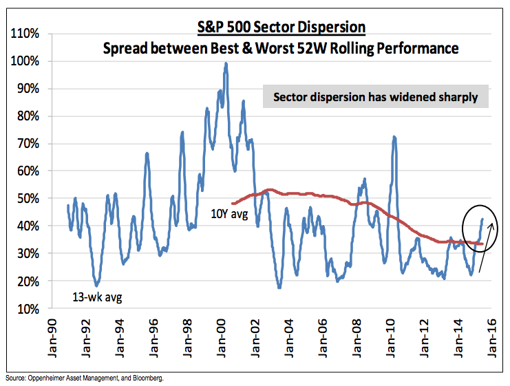
While Wald maintains an overall bullish bent, he notes that identifying winners and losers has been more important this year given the trendless nature of the S&P 500. High dispersion and flat indices make for a frustrated investor class, despite our proximity to the all-time highs:
If the alternative is a bearish view, we believe a bullish S&P 500 outlook remains warranted. However, reality is probably somewhere in the middle as stock-level trends vary considerably. At last week’s low, the S&P 500 was down 3.6% from its all-time high of 2134, but the market environment feels worse than this is because the dispersion of performance has widened sharply. For instance, the spread between the best (Health Care, +24%) and worst (Energy, -24%) performing S&P 500 sectors over the last 52 weeks is the widest since February 2010. This is a reason we continue to place greater emphasis on our sector and stock calls than our market one.

Josh here – If you’re a devoted stockpicker, now is finally your time to shine after five years. Try not to f*** it up.
Source:
Inflection Points
Oppenheimer Asset Management – July 6th 2015


RT @ReformedBroker: Chart o’ the Day: Why the Market Feels Worse Than It Is http://t.co/ecMe2M04pt
RT @ReformedBroker: Chart o’ the Day: Why the Market Feels Worse Than It Is http://t.co/ecMe2M04pt
RT @ReformedBroker: Chart o’ the Day: Why the Market Feels Worse Than It Is http://t.co/ecMe2M04pt
[…] Joshua Brown: Chart o’ the Day: Why the Market Feels Worse Than It Is […]
Josh, why does dispersion and a trend make us feel better than level? It may, but I don’t understand @ReformedBroker http://t.co/y8nGkxuJ20
Chart o’ the Day: Why the Market Feels Worse Than It Is by @ReformedBroker http://t.co/TzzXTxoXr6
RT @victorricciardi: Chart o’ the Day: Why the Market Feels Worse Than It Is by @ReformedBroker http://t.co/TzzXTxoXr6
Chart o’ the Day: Why the Market Feels Worse Than It Is: http://t.co/Dcra4kctEF
Chart o’ the day: why the market feels worse than it is http://t.co/ttX0SL2DU2
Sector dispersion is an opportunity for some cheap active management. http://t.co/NIAXB1j4He
… [Trackback]
[…] Read More Info here to that Topic: thereformedbroker.com/2015/07/06/chart-o-the-day-why-the-market-feels-worse-than-it-is/ […]
… [Trackback]
[…] There you can find 18695 more Information to that Topic: thereformedbroker.com/2015/07/06/chart-o-the-day-why-the-market-feels-worse-than-it-is/ […]
… [Trackback]
[…] Find More on to that Topic: thereformedbroker.com/2015/07/06/chart-o-the-day-why-the-market-feels-worse-than-it-is/ […]
… [Trackback]
[…] Here you will find 62553 additional Information to that Topic: thereformedbroker.com/2015/07/06/chart-o-the-day-why-the-market-feels-worse-than-it-is/ […]
… [Trackback]
[…] Find More here to that Topic: thereformedbroker.com/2015/07/06/chart-o-the-day-why-the-market-feels-worse-than-it-is/ […]