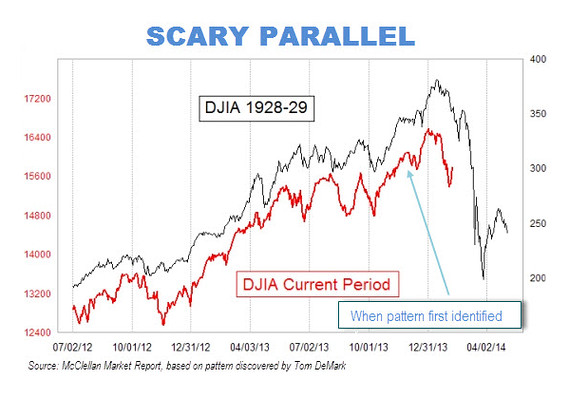
(chart via MarketWatch)
No matter how many times it’s been debunked*, the 1929 stock market overlay chart just will not die.
Probably because you keep clicking on any headline with the number ‘1929’ in it.
Probably because of how provocative the idea is and because of the fact that we are much more likely to be made uncomfortable by fear than we are to be take pleasure in potential opportunity. The studies all confirm that the human animal is, at the end of the day, more risk averse than it is ambitious. This is why content that frightens us can continue to get the traction it does, time after time.
Regardless of the why, most of the people who continually post this chart are looking for attention, page views, subscriptions or your money into their fund. And it’s working. It almost always works – fear-based selling is every bit as time-honored a tradition on The Street as playing on people’s greed is.
By the way, this is not even clever or new – they were paralleling the ’29 chart in 2009 and 2010 (see: Scary Similarity: Charts 1929-1930, and 2008-2010; Big Drop or Crash Ahead?).
The reason why this bothers me is twofold – first, it frightens investors into making poor decisions – big decisions that will have a major impact on their mental health and financial condition well into the future. Second, the more we see this kind of pornography, the more likely it is to have an impact on crowd psychology and become a self-fulfilling prophecy. It’s like putting a disturbed, isolated teenager in front of violent first-person shooter video games all day. If we know that most Americans are scared to invest in their own future, what’s the reason to fuel that fear even further? Sadism? Or just plain exploitative greed?
And lest you think this idea of suggestion is far-fetched, please keep in mind the following, via Bob Shiller’s 2005 second edition of Irrational Exuberance:
Feedback can be modified by many factors, and the news media themselves can certainly have an impact on it. The Wall Street Journal, on the morning of 1987, ran a plot showing the Dow in the 1980s and, just below it, a plot showing the Dow in the 1920s up to and for a month after the crash of 1929. The two plots were aligned so that the current date lined up with the date of the 1929 crash, and so the plot suggested that the crash of 1929 might be about to repeat itself. Investors had the opportunity to see this plot at breakfast a matter of minutes before the crash of 1987 actually started. The Journal was openly suggesting the possibility of a crash starting that day. True, this was not a front-page story, and no one story by itself is decisive in causing a crash. But this little story, and the accompanying plot, appearing as they did on the morning of the crash, probably did help prime investors to be more alert to suggestions of a crash.
Shiller goes on to point out the haunting similarity between the percentage drops of the ’29 and ’87 crashes – 23.1% and 22.6% respectively. Don’t tell me investors weren’t being influenced by what they’d read about the ’29 crash before that final bell rang on October 19th, 1987.
I told myself last May that I was done paying attention this overlay stuff (see: Lying With Charts) and I have basically stuck to this vow. A lot of the “analysis” we all conduct or the things we think are silly, how could we not admit it after all this time? But nothing is quite as ridiculous as saying “this line looks like that line therefore X is bound to happen again.”
It’s not different this time, it’s different every time. I have no problem with fractals, per se, just the extreme conclusions so frequently drawn from them. The simple fact is there are always too many variables for the chart overlay game to be able to call a crash, and the variables themselves are never the same.
* Here are the best mythbusters of the 1929 analog:
Is a 1929 Style Crash Right Around The Corner? (RyanDetrick)
Some Lines Say Maybe the Stock Market Will Go Down (Bloomberg)


… [Trackback]
[…] Here you will find 26763 additional Info on that Topic: thereformedbroker.com/2014/02/13/the-chart-that-wouldnt-die/ […]
… [Trackback]
[…] Here you will find 11928 more Info to that Topic: thereformedbroker.com/2014/02/13/the-chart-that-wouldnt-die/ […]
… [Trackback]
[…] Read More on on that Topic: thereformedbroker.com/2014/02/13/the-chart-that-wouldnt-die/ […]
… [Trackback]
[…] There you will find 12725 additional Info to that Topic: thereformedbroker.com/2014/02/13/the-chart-that-wouldnt-die/ […]
… [Trackback]
[…] Find More Information here to that Topic: thereformedbroker.com/2014/02/13/the-chart-that-wouldnt-die/ […]
… [Trackback]
[…] Here you can find 87893 additional Information to that Topic: thereformedbroker.com/2014/02/13/the-chart-that-wouldnt-die/ […]
… [Trackback]
[…] Here you will find 57797 additional Info on that Topic: thereformedbroker.com/2014/02/13/the-chart-that-wouldnt-die/ […]