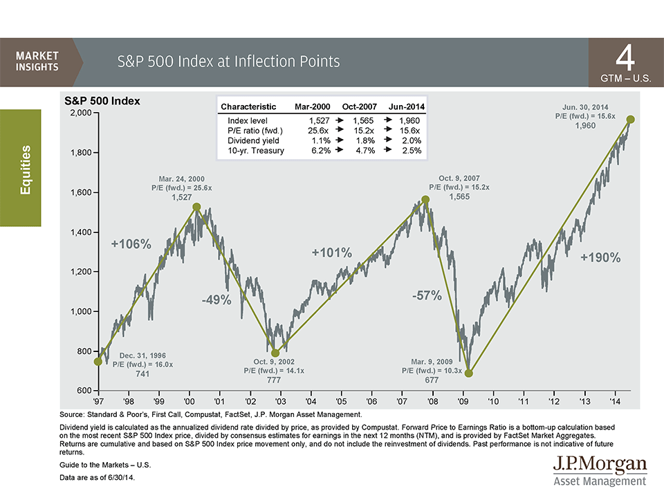
The below chart comes to us from JPMorgan Asset Management’s Q3 Guide to the Markets slide presentation…

A few things should jump out at you…
First, this stock market recovery has now just about lapped the one that followed the 2000-2002 recession, 190% vs 101%.
Second, although we are currently selling at the same PE ratio as we were at the market’s top in 2007, there is one very important difference – we’re at about half the yield on the 10-year treasury versus back then. In 2007, virtually all economic growth was coming from private sector leverage, specifically in the real estate market. Today, lots of growth is also coming from leverage – but it’s mostly the Fed printing to buy bonds from the Treasury and then letting them mature and roll off. This is funding deficit spending and preventing a lot of really tough budgetary battles in Congress.
This is powering a slowly-growing economy and a record amount of buyback activity which is helping to fuel corporate prosperity, which in turn, theoretically, is creating private sector jobs.
The whole mutually beneficial system I’m describing is what Jeff Gundlach has called a “circular financing scheme”. He says that if it works, it’s the most important invention since the telegraph.
One more thing – we’re nowhere near the PE ratio the S&P 500 printed at the height of the dot com boom. I would also remind you that – forget the S&P – at the top of the market in 2000 it was really the Nasdaq that was the focal point for stock investors, and that motherf*cker was trading at 96 times earnings. Even uber-perma-bull Jeremy Siegel shouted from the rooftops in March of 2000 that the large cap tech stocks of the Nasdaq were a “sucker bet” to be long.
So what can we learn from looking at these inflection points? Well, you can remind the next bubble-screamer you come across of the following three takeaways:
a) US stocks are nowhere near as overvalued now on an absolute basis as they were in 2000.
b) US stocks are nowhere near as overvalued now on a relative basis (think bond yields) as they were in 2007. Plus, we’re actually getting more in today’s dividend yield versus back then.
c) during the prior two tops, stocks got cut in half from both absurd valuation levels (2000) and from reasonable valuation levels (2007) – so valuation levels alone are not ever going to be your tell.
End of lesson.


[…] A Quick Lesson on Market Tops – (The Reformed Broker) […]
[…] about a market top? Josh Brown provides a short lesson about market tops, comparing key points from the current situation with 2000 and 2007. As he often does, he hits the […]
.
ñïñ!
.
ñïàñèáî çà èíôó!
.
thanks for information.
The Silent Shard
This could likely be very practical for some of your work opportunities I intend to really don’t only with my blog but
Third Flower
My wife and i have already been now delighted that Albert could perform his scientific tests on account of the tips he had by means of your online page. It is actually every now and then perplexing to just normally be freely giving methods which many p…
Thorn of Girl
Superb information and facts may be located on this web website.
… [Trackback]
[…] Find More Information here to that Topic: thereformedbroker.com/2014/07/17/a-quick-lesson-on-market-tops/ […]
… [Trackback]
[…] Read More to that Topic: thereformedbroker.com/2014/07/17/a-quick-lesson-on-market-tops/ […]
… [Trackback]
[…] Here you will find 64705 additional Information on that Topic: thereformedbroker.com/2014/07/17/a-quick-lesson-on-market-tops/ […]
… [Trackback]
[…] There you can find 34196 more Info to that Topic: thereformedbroker.com/2014/07/17/a-quick-lesson-on-market-tops/ […]
… [Trackback]
[…] Find More Info here to that Topic: thereformedbroker.com/2014/07/17/a-quick-lesson-on-market-tops/ […]
… [Trackback]
[…] Find More on that Topic: thereformedbroker.com/2014/07/17/a-quick-lesson-on-market-tops/ […]
… [Trackback]
[…] Find More on that Topic: thereformedbroker.com/2014/07/17/a-quick-lesson-on-market-tops/ […]